SMARTSHEET SHORTCUT BAR
Design, Research, Prototyping
We created an efficient way for users of Smartsheet to navigate through their files by giving them the ability to prioritize documents and projects and keep them within reach, while maintaining their workflow.
PROJECT OVERVIEW
Smartsheet is a cloud-based project management tool. They provide their users with a vast set of ways to structure their work and continuously look for ways to help customers feel pride in what they do. They approached my team looking to find a way to improve their customers' workflow. We met with a wide variety of Smartsheet users who perfected their individual workflows.
Through interviews & observation my team discovered the opportunity to
reduce the time users spent navigating through tabs. Interruption had a large impact on indivdual's flow. If interrupted while searching for the desired tab, they would have to guess where they left off. Bouncing in and out of their flow made it harder for them to get around their Smartsheet workspace.
We sketched with each user we interviewed, held a design studio with Smartsheet, and had internal sketching sessions.
After we filtered down and analyzed our work, we developed and tested the Smartsheet Shortcut Bar. In user testing we found that the Shortcut Bar allowed people to navigate between their most used pages, reduce clicks, let them flow seamlessly through Smartsheet, while leaving their established working patterns untouched.
Learn more about my process below.
RESEARCH
Many different industries and organizations use Smartsheet. To understand user pain points and ensure we were designing fixes for real problems, my team and I visited users in their places of work.
After talking with stakeholders, we established that they were looking to improve the day-to-day work lives of heavy Smartsheet users. We interviewed 8 Project Managers at 3 companies in the Seattle area.
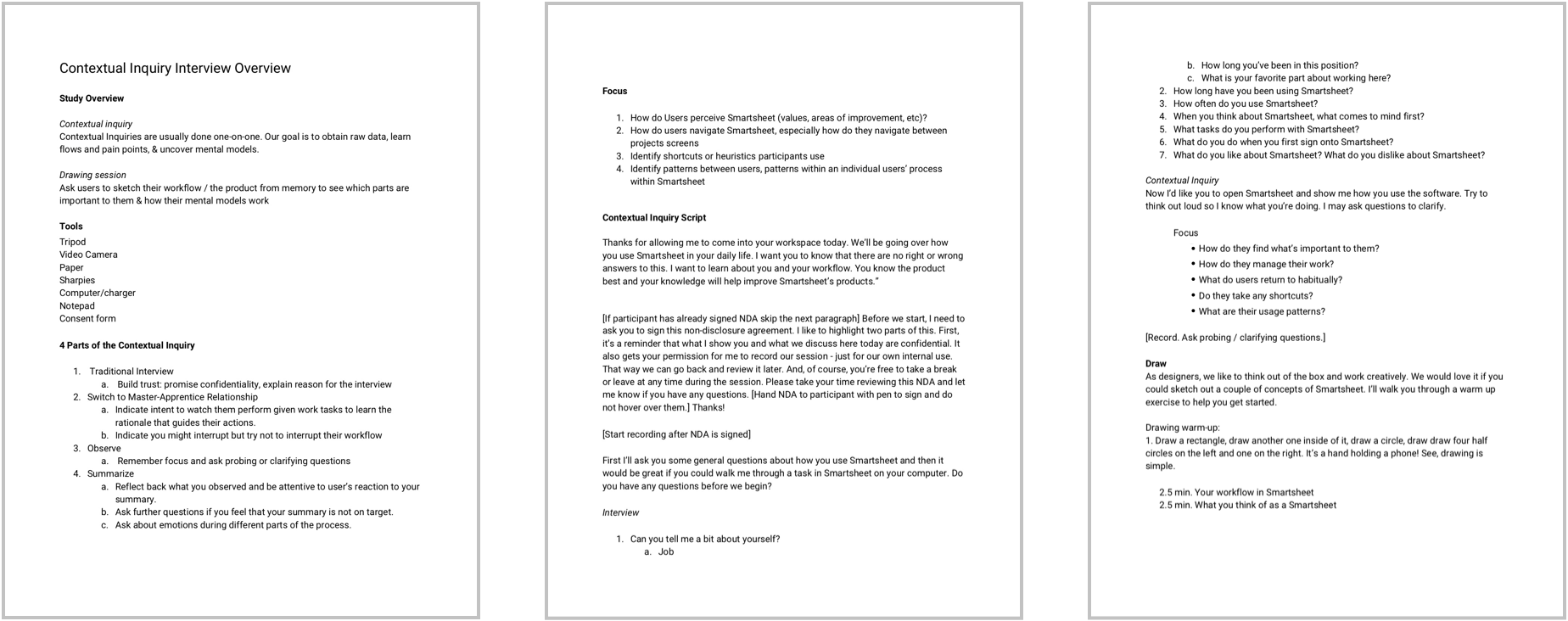
We started by conducting contextual inquiries which allowed us to hear directly from users for by talking seeing them in their actual work enviornment. We then ran semi-structured interviews mixed with sketching sessions.
The sketching process with each user was my personal favorite. By putting pen to paper, the user was enabled to show me exactly what they needed from Smartsheet.
Post interviews, my team and I analyzed our findings. We produced an affinity map, key takeaways, and a persona.
PERSONA
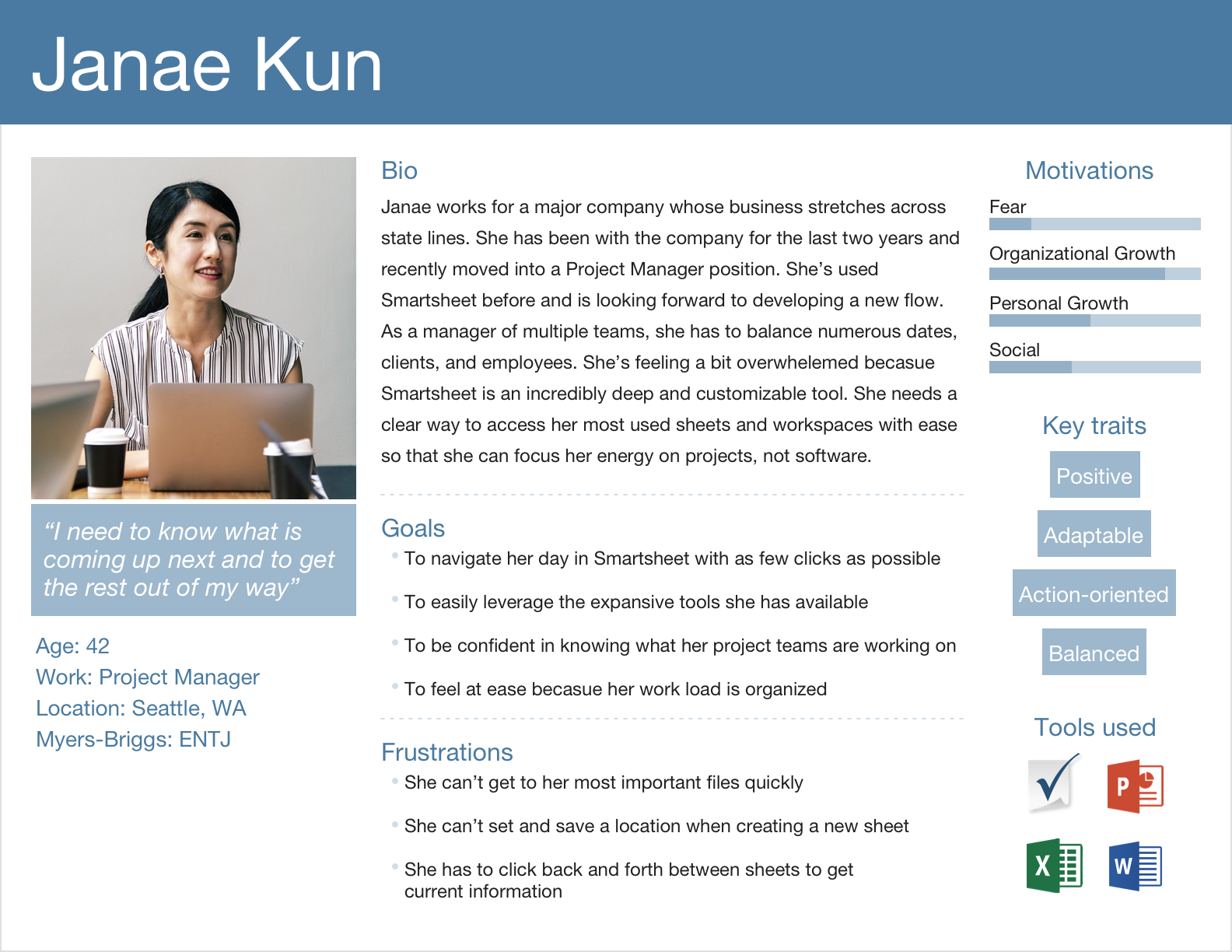
Janae is a Project Manager who needs to streamline her workflow
She wants to give her team her full attention when needed & jump back into Smartsheet without missing a beat
Janae needs to get her current projects quickly with as few clicks as possible
Janae has access to thousands of files within her company
"I need to know what is coming up next & to get the rest out of my way"
"I need to know what is coming up next &
to get the rest out of my way"
USER JOURNEY
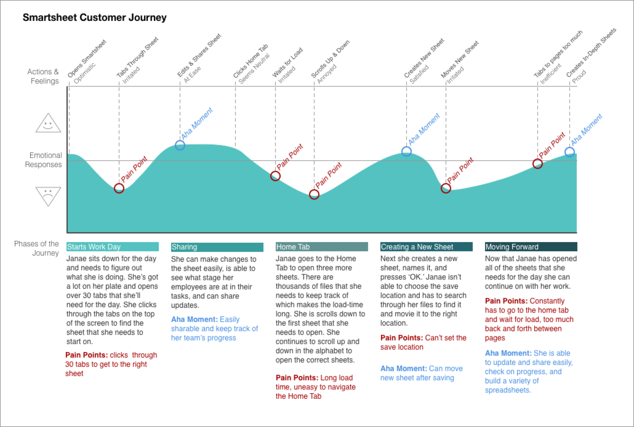
Janae can’t set the save location when she makes a new sheet
On average, Janae is clicking through 30 tabs to get to the right sheet, multiple times a day
There is a long load time in her home tab, where all files are stored
DESIGN STUDIO & SKETCHING
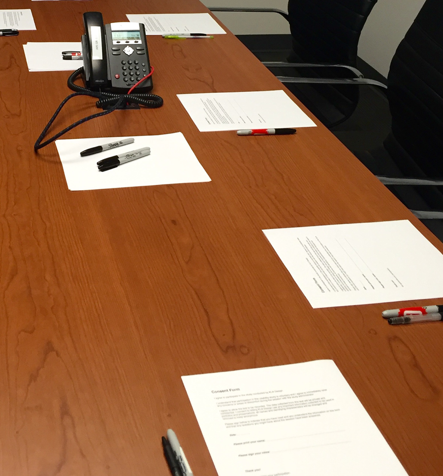
Once we got to know Janae a bit better, we brought
our findings back to the stakeholders at Smartsheet
and completed a design studio. This was an important step for us.
Meeting with the stakeholders helped us to further
refine our scope and to ensure that we were understanding all of the massive capabilities that Smartsheet offers its customers.
We left with a collection of ideas and feedback for our metaphorical design bucket.
Once we got to know Janae a bit better, we brought our findings back to the stakeholders at Smartsheet and completed a design studio. This was an important step for us.
Meeting with the stakeholders helped us to further refine our scope and to ensure that we were understanding all of the massive capabilities that Smartsheet offers its customers.
We left with a collection of ideas and feedback for our metaphorical design bucket.
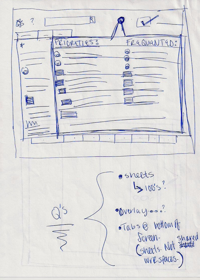
My team and I sat down for our own design studio next. We came up with the idea for a collapsable shortcut bar that would allow Janae to keep important sheets and files within a one-click reach.
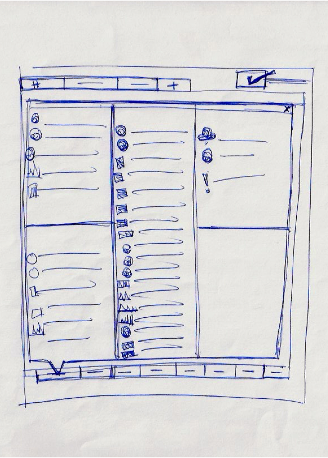
Janae has patterns of work & a flow established; it was essential for us to leave her process undisturbed.
It was crucial for us to make the shortcut bar as unobtrusive but accessible as possible.
Janae has patterns of work & a flow established; it was essential for us to leave her process undisturbed. It was crucial for us to make the shortcut bar as unobtrusive but accessible as possible.
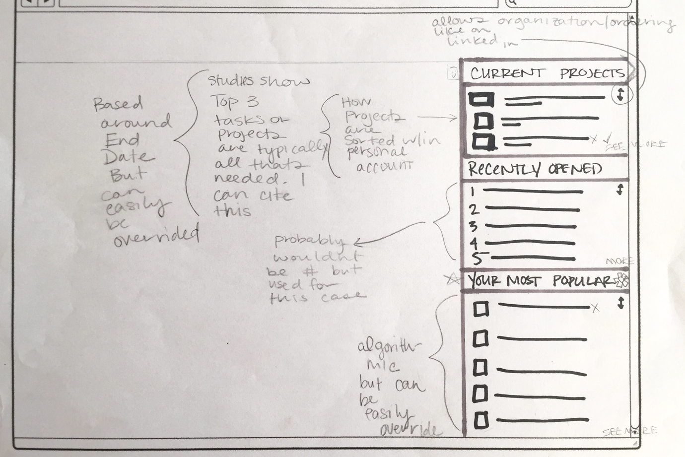
We explored different options and made the final placement of the tab on the right-hand side so that it would be visible in any screen size without obscuring other navigation. When expanded, Janae can still view and access anything within Smartsheet without having to close the shortcut bar.
THE DESIGN
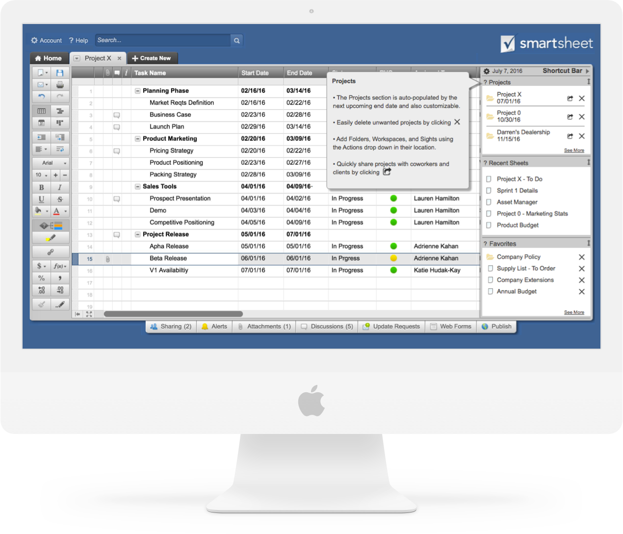
THE SHORTCUT BAR
In order to prevent cognitive overload for Janae and have her end up with all of her files in the shortcut bar, there is a limit to the amount of files that she can link to within the shortcut bar.

The Shortcut Bar has three sections:
PROJECTS
big-picture content, like project folders and workspaces.
RECENT SHEETS
an auto-populating section that shows the last five files opened.
FAVORITES
Originally titled References, holds
any sheet or document that you might not need daily, but is important to have on-hand.
THE NEW "NEW SHEET"
While the shortcut bar was our main focus, there was another pain point that needed to be addressed.
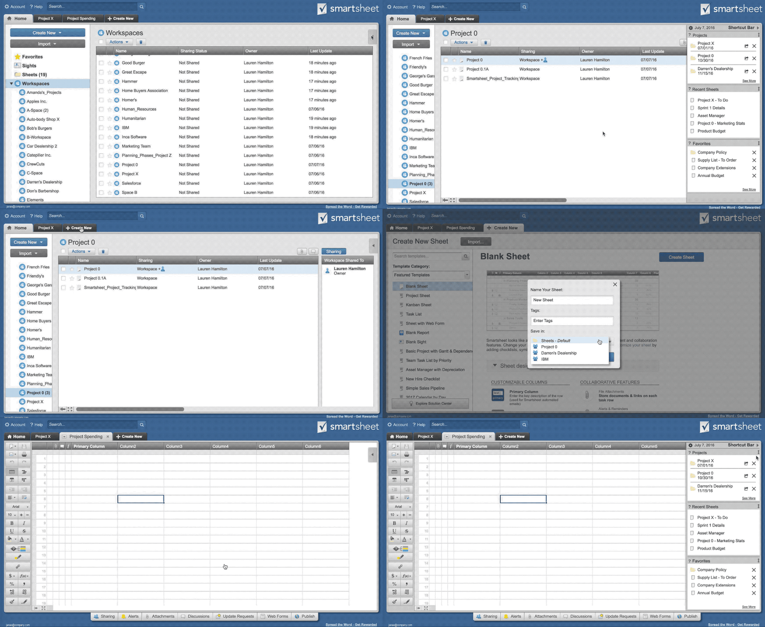
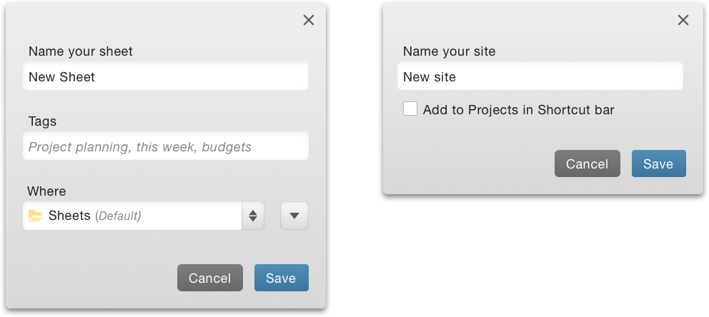
Users didn't have the ability to set a save location when creating a new sheet. They were having to look for their newly saved sheet and move it to the correct location. Although a seemingly small annoyance, when added up, this wasted a lot of valuable time in users work-flow.
Leveraging the existing new sheet overlay, we implemented a drop down list so that users could save their sheets exactly where they wanted them during creation.
TESTING
"I just want to click on things less to get to where I am going. The Shortcut Bar does this for me."
"I just want to click on things less to get to where I'm going. The Shortcut Bar does this for me."
User Tests were carried out in-person and remotely. We completed two rounds of testing and iterated designs after the first set of participants.
After our first iteration, we made changes in taxonomy and cut a feature that didn’t prove useful. People weren’t fully aware of what each section in the sidebar could do, so we implemented tooltips on hover.
We found user success in our second iteration and presented the finding and final designs to stakeholders, including C-level executives.
We found user success in our second iteration and presented the finding and final designs to stakeholders, including
C-level executives.
GOING FORWARD
My team and I had a specific audience to focus on. We researched, designed, and tested over the course of our sprint and found a solution that was effective for Smartsheet power users.
In future rounds of testing, it would be important to research how non-power-users interact and understand the shortcut bar. Is it still intuitive and helpful for them? Implementing and testing an “Add to Shortcut Bar” right-click action or a keyboard shortcut to further reduce clicking and time spent completing actions is also crucial.
Third, exploring the customization possibilities within the shortcut bar to really hone in on what each user needs within their Smartsheet workflow.

