

HANGOUTS MEET
To comply with NDA, I have omitted & obfuscated confidential information in this case study. All info in this case study is my own & doesn’t necessarily reflect the views of Google. For confidentiality reasons I have also omitted the actual values for metrics
To comply with NDA, I have omitted & obfuscated confidential information in this case study. All info in this case study is my own & doesn’t necessarily reflect the views of Google. For confidentiality reasons I have also omitted the actual values for metrics
Overview
Interaction Design, prototyping, user research - 2016
Problem.
Launch was blocked because Meet was available in Landscape mode and portait mode wasn’t up par
A mobile landscape design and roll-out plan was needed in order for Material Design to approve public launch
Action.
Led a design audit of the current mobile build
Designed flows based on user testing & successfully evangelized for the best experience with stakeholders
Built prototype for testing
Worked with Eng to optimize use of existing code
Result.
Material Design sign-off for public launch
Designs that fit user’s mental models — immersive and multitasking views
Externally tested flows that would transition seamlessly onto tablet when supported
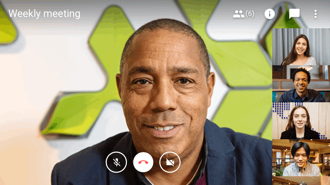
Getting to know Google Meet
Meet crosses 6 platforms— ensuring consistency across all was paramount

Web
TV
Mimo
iOS
Android
Buddy
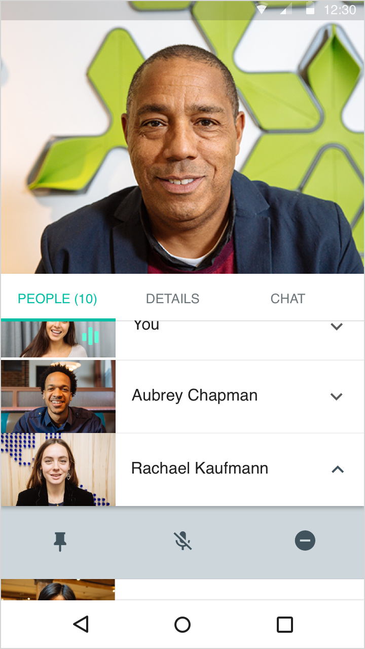
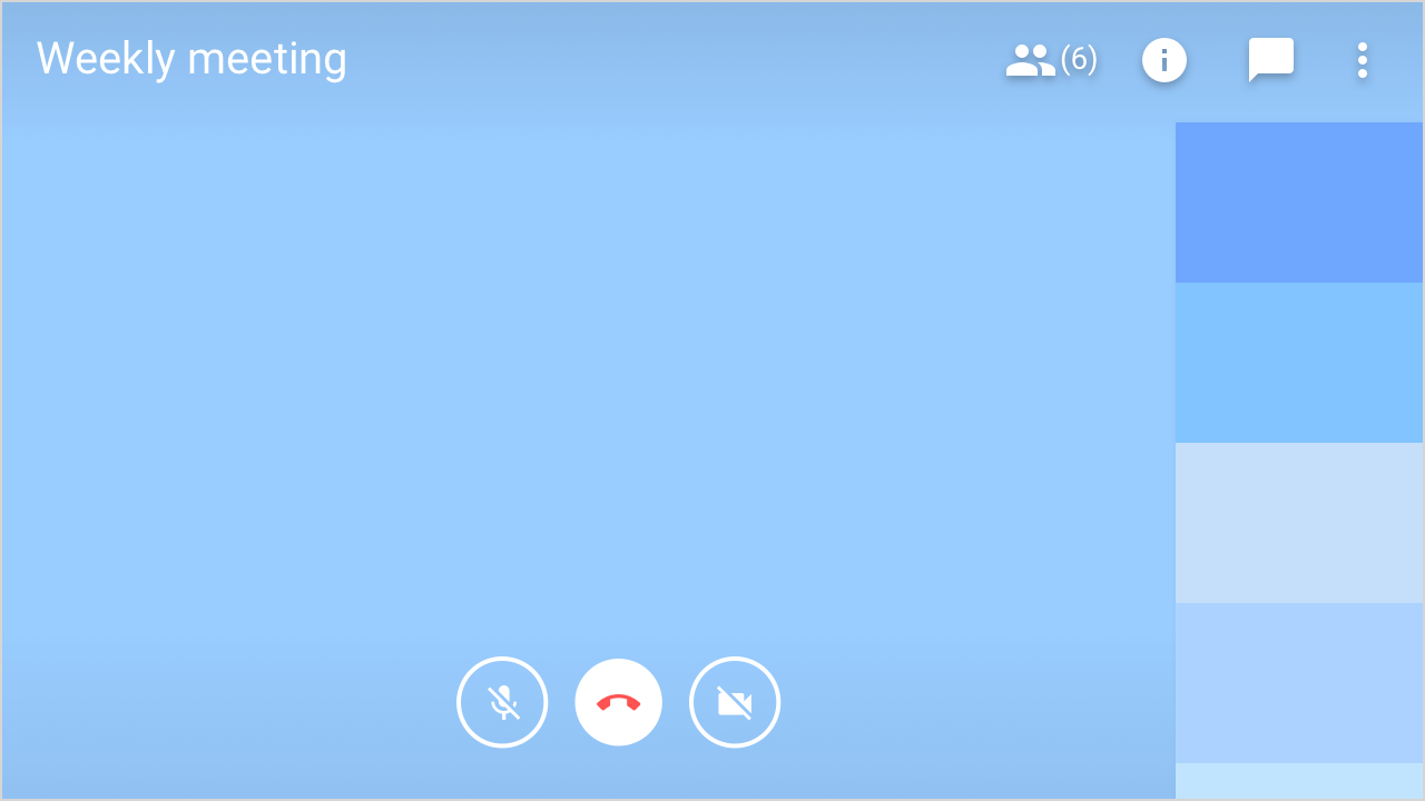
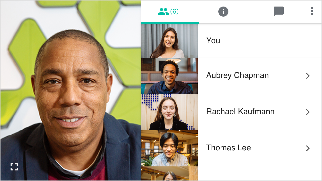
Meeting participant capabilities

Pinning
Locks a participant to the main screen for thier computer only
Muting
Silences the audio fof the respective participant for the entire meeting

Removing
Removing kicks people out of the meeting after a confirmation dialog
Initial research
I began by digesting previous research done on Meet for web & TV platforms. My goal was to understand all aspects of our user's needs. From this research, I established three key use cases.
Users need a way to view presentations in full-screen
Users need a way to view presentations
in full-screen
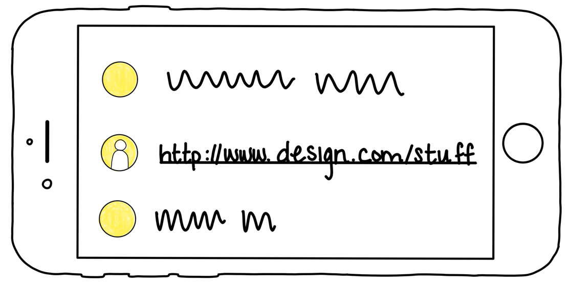
Users must be able to access links in chat

Users want to be able to see facial expressions and body language
more clearly
Key Finding
Enterprise products are high-stakes for users
Enterprise products are high-stakes for users
Preliminary research confirmed that people knew how to use Meet on mobile but expressed confusion around the drawer in the people list.
People were unsure if the icons in the drawer affected the people above or below them and wouldn’t feel comfortable interacting with them.
This echoed past research that found users are less likely to explore enterprise apps to figure things out becasue the stakes are higher
Personal Design Motto
You can accidentally hang up on your Mom, but you never want to hang up on your boss
Enterprise products are high-stakes for users
It was clear that users had 2 different mental models for their mobile meetings:
Multitasking view & Immersive View
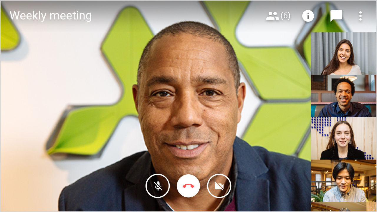
Designing the Multitasking view
In multitasking view, users wanted access to their meeting details, participant information & chat
What didn't work
Self-view pulled out
Breaks visual pattern of who is in
the meeting and movement splits attention between you and who is talking - on the “mainstage”

Exposed Icons
Visually cluttered & overwhelming
Split main-stage
Not enough priority on speaker
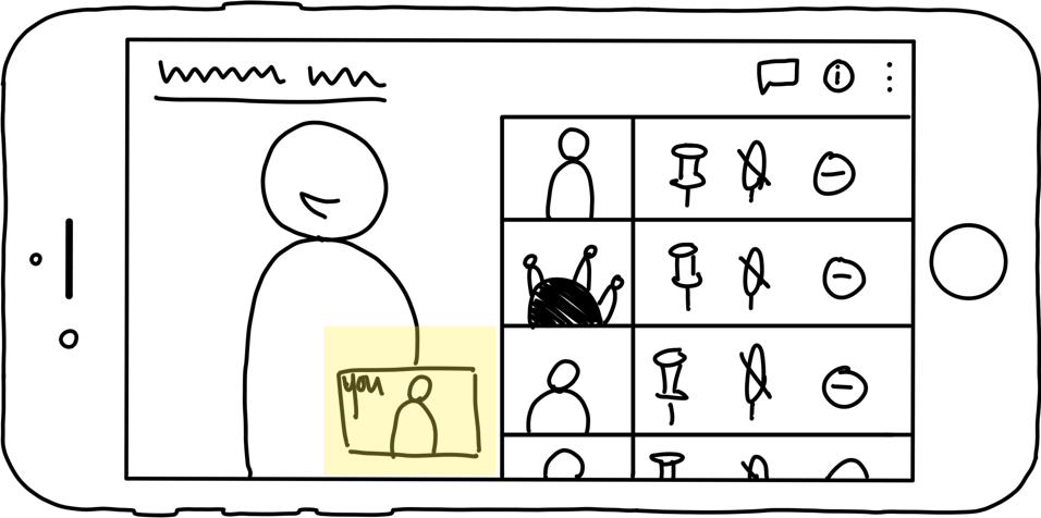
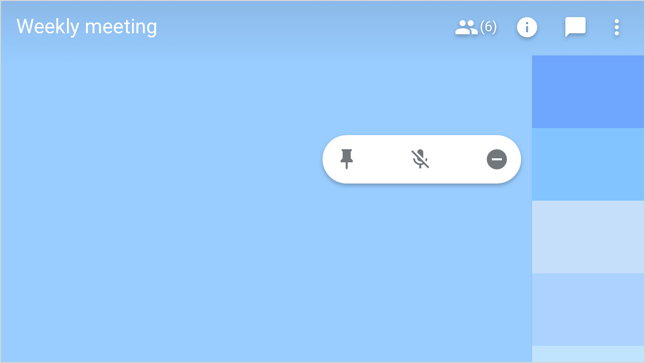
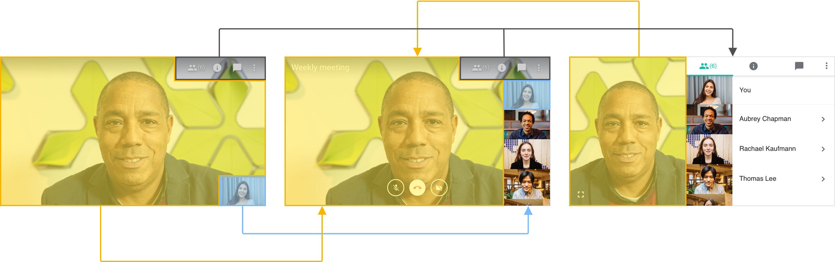
While sketching, I reflected upon the intitial research to see if I could increase understanding of the drawer & who they affected
The Solution
I created a design that added more context for the user by moving the actions that dropped down to an inline drawer. This let people know who they were pinning, muting, and removing.
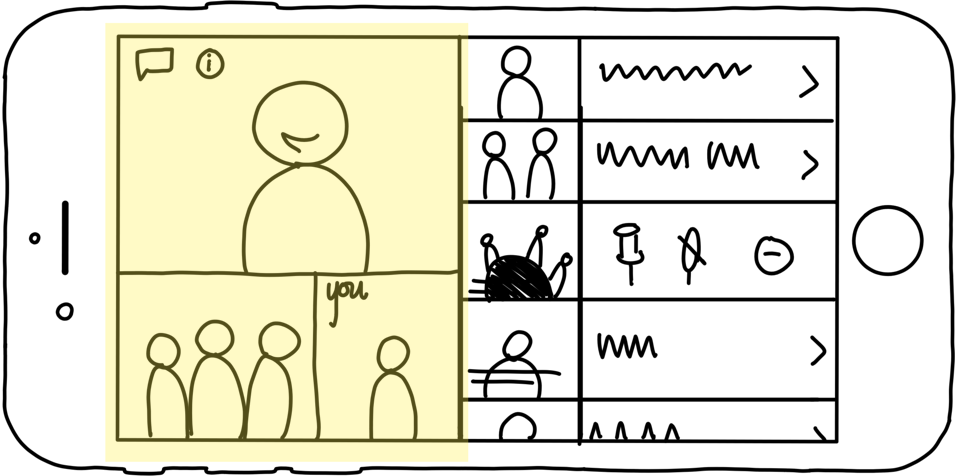
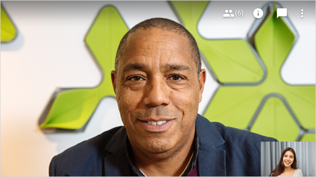
Designing the Immersive View
In the Immersive View, people wanted to maximize the video meeting space & minimize on-screen distractions.
Because this was a very different use case, I made a list of what I would need to include.
I stripped everything back & added features back in while maintaining parity & giving users an easy transition between each mode.
After sketching there were 3 main views
Controls, tabs & filmstrip open
First appears when you rotate your phone into landscape
Self-view only
Self-view can be swiped away to provide an unobstructed view on the presentation or speaker
Filmstrip and tabs visible
Tapping on the self-view opens &
closes the filmstrip and brigns back the tabs at the top
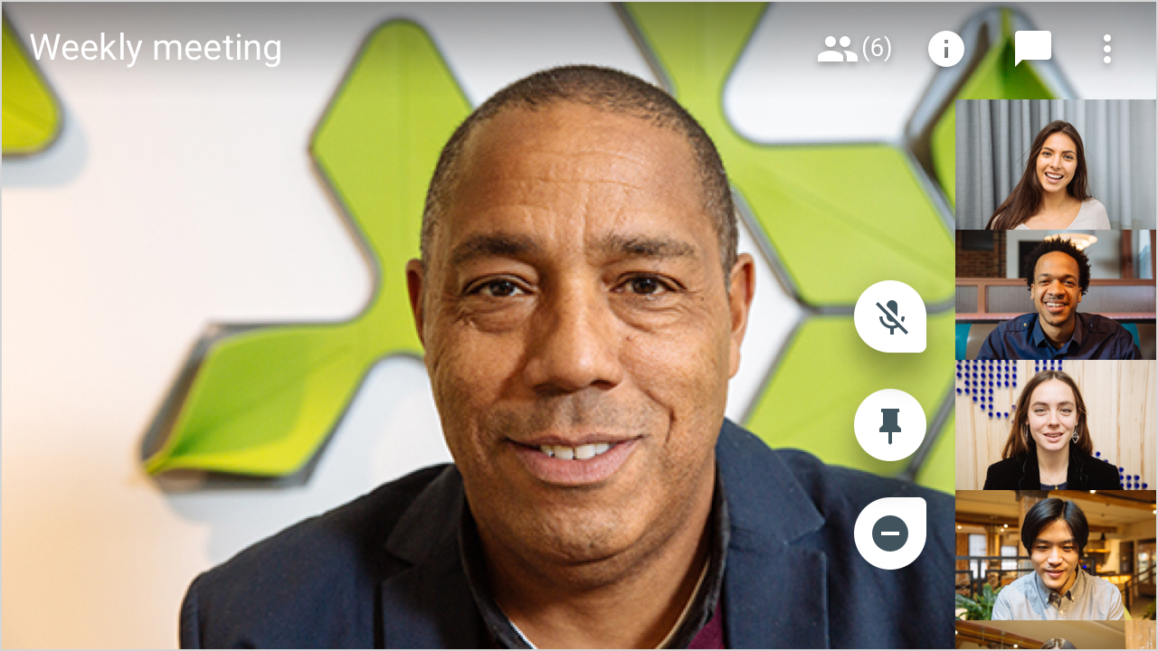
Actions in Immersive View
Next I started exploring icon options for pinning, muting,
& removing participants
Next I started exploring icon options for pinning, muting, & removing participants

Icons are too light against the background, even on an actual video feed
Icons are too light against the background, even on an actual video feed
Feels like one button and is too intrusive, overlaps with peoples faces

Vertical alignment takes up less video space but it is still unclear who the actions will affect
The Decision
Keeping the vertical alignment & changing hte button shapes gave context to the user & stayed out of their way
Navigating between views
Localization & privacy needs
Localization was tricky on mobile since the tabs were titled
with words.
I implemented icons on mobile which resulted in a better experience across languages. This brought us closer to exact parity with TV & Web platforms which also used icons.
Localization was tricky on mobile since the tabs were titled with words. I implemented icons on mobile which resulted in a better experience across languages. This brought us closer to exact parity with TV & Web platforms which also used icons.
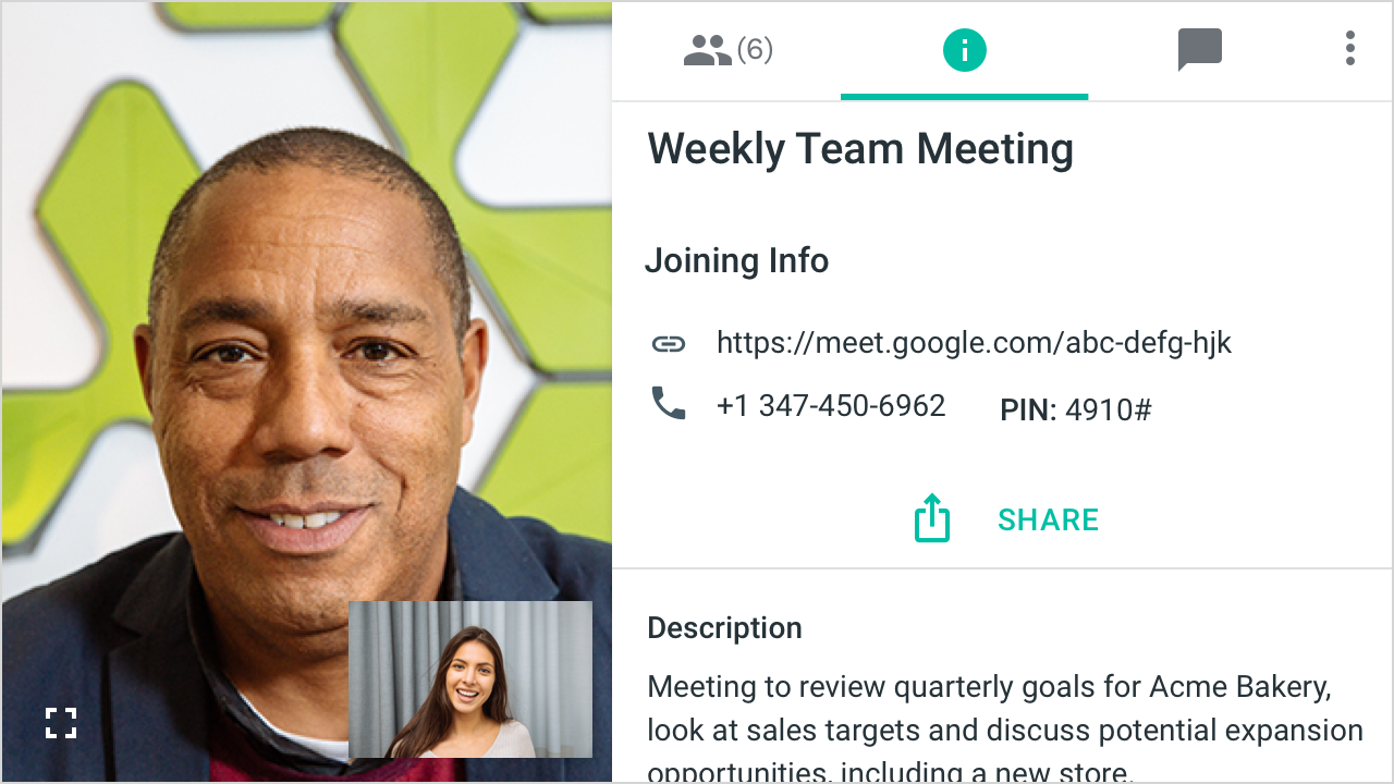
When the user is on the chat or details tab, their self-view appears outside of the right panel. It can be dismissed by swiping and gives users a less interrupted view of the mainstage while meeting Legal & Privacy requirements.
When the user is on the chat or details tab, their self-view appears outside of the right panel. It can be dismissed by swiping and gives users a less interrupted view of the mainstage while meeting Legal & Privacy requirements.
User testing
We went through two rounds of testing & both turned out well for the proposed designs.
I built a prototype to test with external users & worked closely with research. We used Concurrent Think Aloud Testing to understand how users felt about the new designs
“This is actually really nice. There are still the people on the side & I like that there are three buttons at the top — it’s the same as before”
"I would tell them we should get away from Webex. The features here are nice!"
"I would tell them we should get away from Webex. The features here are nice!"
Material implemented my
caret pattern as standard across Google
We also tested to see how people would react to
an atypical use of the caret.
Users didn't notice that it was pointing right and opened to the left.
They thought it made sense to have it reaveal icons.
I worked directly with Google Material team to establish approval for this new caret pattern.
Phased Rollout
BALANCING BUSINESS, ENGINEERING, & USER NEEDS
BALANCING BUSINESS, ENGINEERING,
& USER NEEDS
Through close conversation with engineers and product managers, I knew that designing and building out the updated mobile experience would be challenging before our public launch date.
With that in mind, I established a plan so that Meet would provide users with a seamless experience and ensure legal and privacy needs were met while engineers built out the full mobile design.
First we launched a partial immersive view, which would allow users to see the filmstrip and their self-view. If they engaged with a participant, it would open into the multitasking view.
The multi-tasking view had little overhead because it simply moved the mainstage video to the left of the tabs.
In a fast-follow release after our public launch, we prioritized adding in pinning muting, and removing into the immersive view.
This gave users the functionality they expected from the portait & multitasking views and maintained the lighter weight experience of the immersive view.
The third and final release rolled out the updated drawer which increased user confidence in who they were pinning, muting, and removing.
The phased roll-out plan presented to key stakeholders allowed the entire product to launch publicly, on schedule.
Review
Problem
Launch was blocked because Meet was available in Landscape mode and portait mode wasn’t up par
A mobile landscape design and roll-out plan was needed in order for Material Design to approve public launch
Action
Led a design audit of the current mobile build
Designed flows based on user testing & successfully evangelized for the best experience with stakeholders
Built prototype for testing
Worked with Eng to optimize use of existing code
Result
Material Design sign-off for public launch
Designs that fit user’s mental models — immersive and multitasking views
Externally tested flows that would transition seamlessly onto tablet when supported
Copyright 2025